Major Update! (Virtual Control Pad Added)

Hi folks!
A major update has been made to the Dwelling Nightmares (Alpha Demo)!
As of 6/2/2020, I have created a virtual pad to be used for mobile users in order to lessen the stress in using the items from the menu and the hassle of using it whiles standing still. The player can now use the virtual pad to move the character, open up the Menu to access the existing tabs.
(UPDATE: The category tab for items has been removed to further lessen the hassle of clicking the screen multiple times just to use a specific key item.)
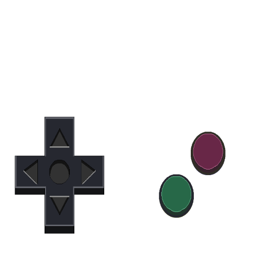
The first version of the virtual game pad are somewhat retro looking. (Sample shown below)
Virtual Game Pad v1.0 (Made using GIMP 2.10)

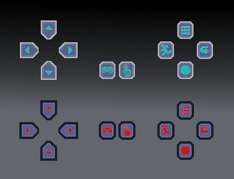
The design is simple with appealing light and easy to look at colors and can work even in less opacity. However, the design does not fit the plugin used for the game so I scratched this idea and made a new one which looks a bit more modern in style. (Sample shown below)
Virtual Game Pad v1.1 (Made using GIMP 2.10)

The design here are more modern in approach by using dark outline color to make each button stand out in the background combined with a dark but easy to see reddish button colors for fast identification.
The game pad and touch pad buttons serves as a TOGGLE in order to give freedom to the player to use their mobile touchscreen if they want to and go back to the game pad whenever they desire so.
However, the arrow button (right button on the right shoulder screen) are for now useless, the primary use for it is to cancel any existing interactions and closing menus if ever they called to the scene. But due to the the current limitation of the plugin, I temporarily removed it's use as the game can still be played without it. But worry not as I found new different ways to use the right button in the future updates of the game. Stay tuned for that.
Additionally, a LIGHT color scheme are also created which I decided to use in the demo game for now. I am working out to see if I can add a LIGHT and DARK mode versions for the virtual pad.
The light color scheme are more bright and vibrant to the eyes to make sure that It stands out especially in the dark areas of the game. It works well even in 100% opacity out of the maximum 255% the game can provide.
In the end the virtual pad is currently working fine and I am still searching/testing to see if any bugs will be found.
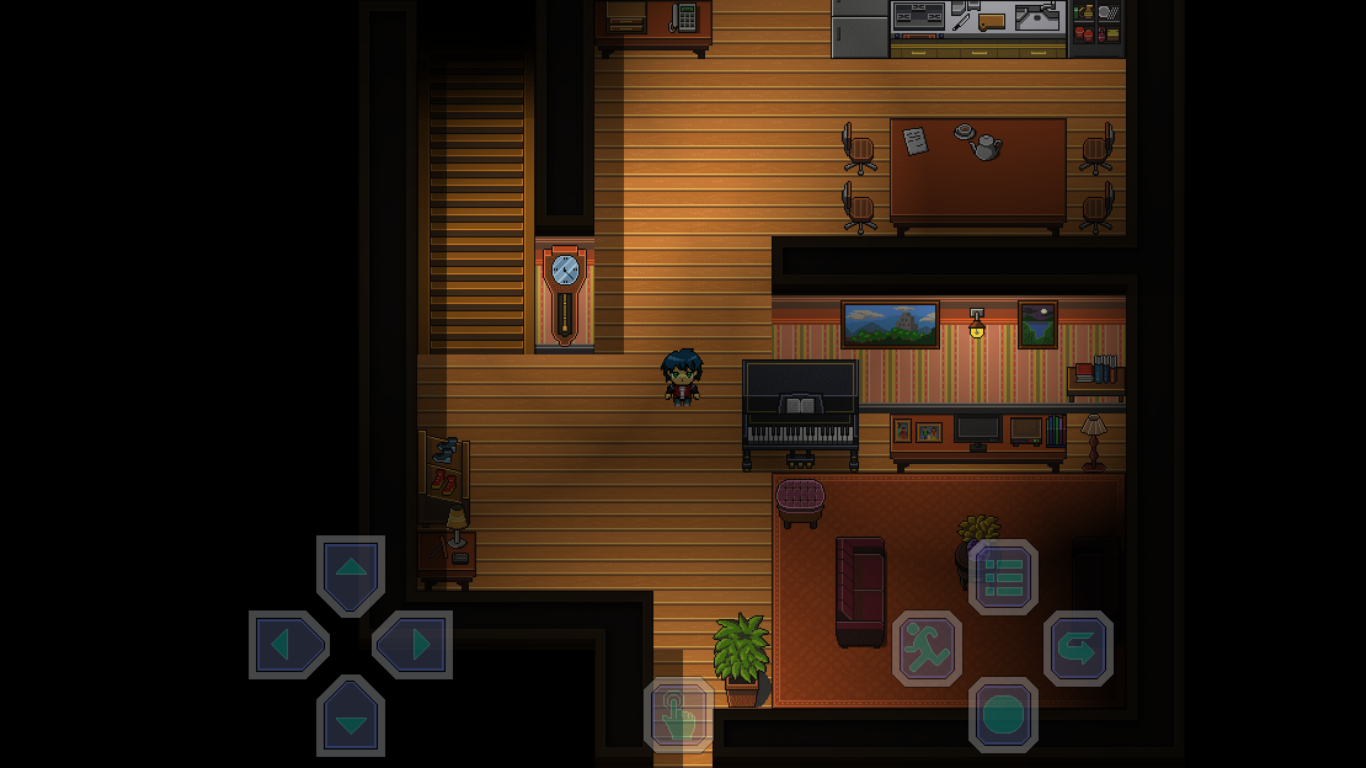
Here is the final look of the virtual pad captured in game. (Sample shown below)

All kinds of feedback and suggestions are welcome!
This ends the first major update for the demo.
Dwelling Nightmares (Early Access)
A short puzzle horror adventure game.
| Status | In development |
| Author | Chadzter |
| Genre | Puzzle, Adventure |
| Tags | Atmospheric, Dark, Horror, Mystery, Psychological Horror, RPG Maker, Singleplayer, Survival Horror |
More posts
- Bug fixes and Changelogs v1.5Apr 21, 2021
- Bug fixes and Changelogs v1.4Apr 14, 2021
- Dwelling Nightmares - Version 1.4 major update!Apr 12, 2021
- Project continuation and incoming progress!Mar 24, 2021
- Bug fixes and Changelogs v1.3Jun 06, 2020
- Bug fixes and Changelogs v1.2Jun 05, 2020
- Bug fixes and Changelogs v1.1Jun 04, 2020
- Bug fixes and Changelogs v1.0Jun 04, 2020
- Finally! A demo is available!Jun 02, 2020

Leave a comment
Log in with itch.io to leave a comment.